Project 1: ASE Academy Branding
Context:
For this project, I worked with a new team at the ASE called the ASE Academy, which offered courses based on ASE concepts and methods. These courses were available to any teams within the Capgemini ecosystem, including both Capgemini employees and clients. They generally lasted 6-12 weeks and included virtual workshops, resources, and practice/implementation suggestions.
Research:
Understand the client: Who are the ASE Academy? what do they do? What do they stand for? The ASE Academy is a training program based on the ASE methodology of facilitation and leadership. They teach models and tools related to ESG, equity, storytelling, and leadership, all with the goal of fostering high- performing teams. Keywords: authenticity, sustainability, facilitation, collaboration, transformation, leadership, equity, inclusion, high-performing teams.
Understand the problem: The ASE Academy was responsible for self-promotion, primarily targeting internal Capgemini teams to utilize their services. They needed branding that could be used for marketing on internal and external platforms, as well as feed into their expanding catalog of workshop content. Additionally, the team had limited artist resources, so the VI needed to be flexible, quick to learn, and easy to translate across projects. It also had to mesh well with Capgemini VI, including fonts, color palettes, and tone.
Understand the audience: The target audience was the broader Capgemini ecosystem, especially account managers, who could use the service for their internal teams or as a service for clients. A secondary audience was Cagemini clients, who could utilize the offering directly as part of their ongoing relationship with Capgemini.
Solution:
Create an ASE Academy universe, with a set of identifiable characters who could represent relationships, qualities, and experiences the Academy teaches about. This allows flexibility, as the world can grow as needed to feature new characters and situations. It embodies the Academy’s values, from storytelling to inclusion, and provides a framework to shape and communicate content. It also creates engagement and invites discussion, as Capgemini employees (target audience) see familiar characters reappear over time. And it builds consistency across marketing and course content as both libraries expand over time.
Process:
Develop a suitable art style and base set of characters, iterating and collaborating with ASE Academy team, fellow visualization artists, and animation contractors.
Define and document process pipeline for various assets, including animated explainer videos and illustrated content (social media posts, internal content, etc).
Share process with fellow artists and ASE Academy team to verify understanding and alignment.
Assess results, reviewing project impact and discussing with Academy team if it met expectations and any changes needed going forward.


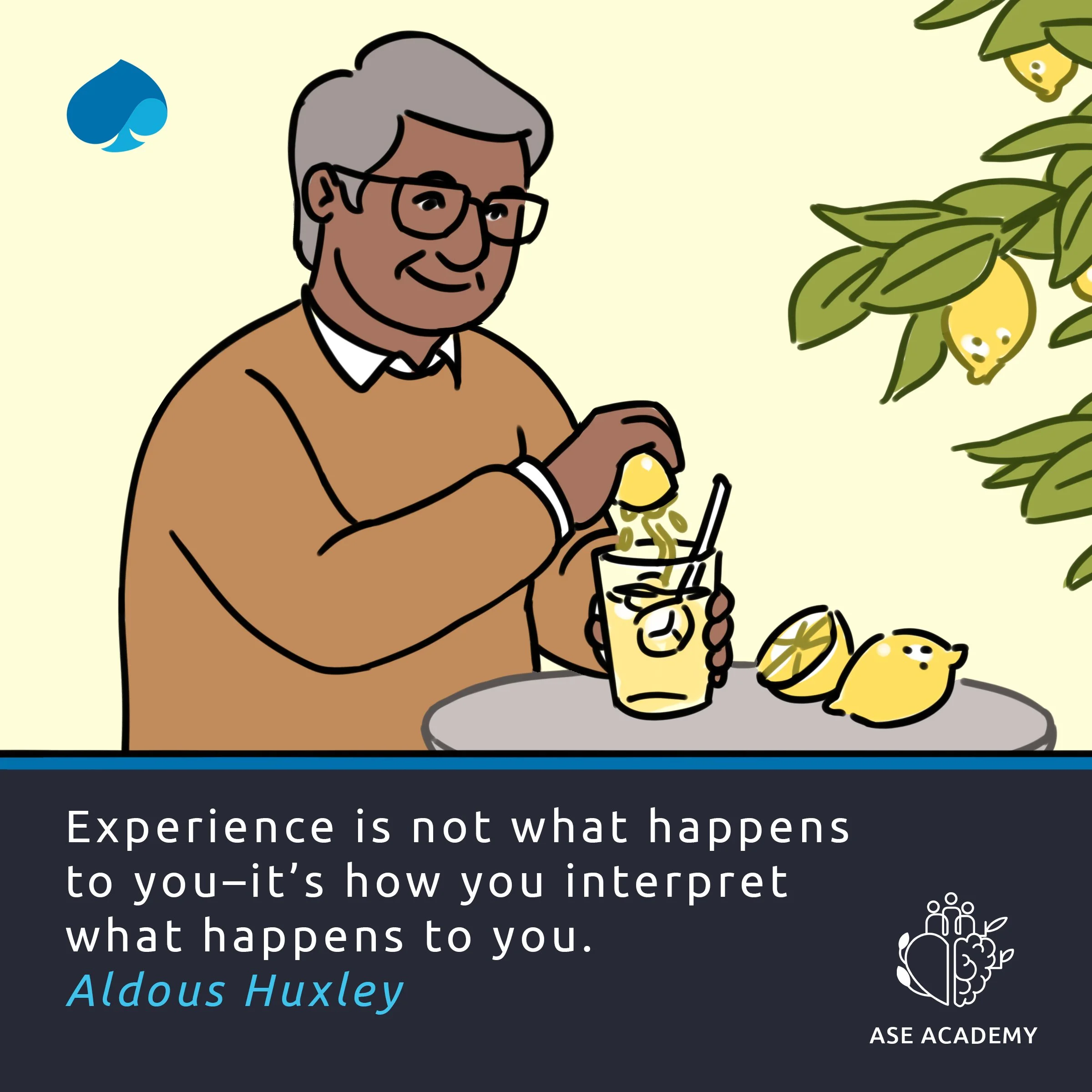
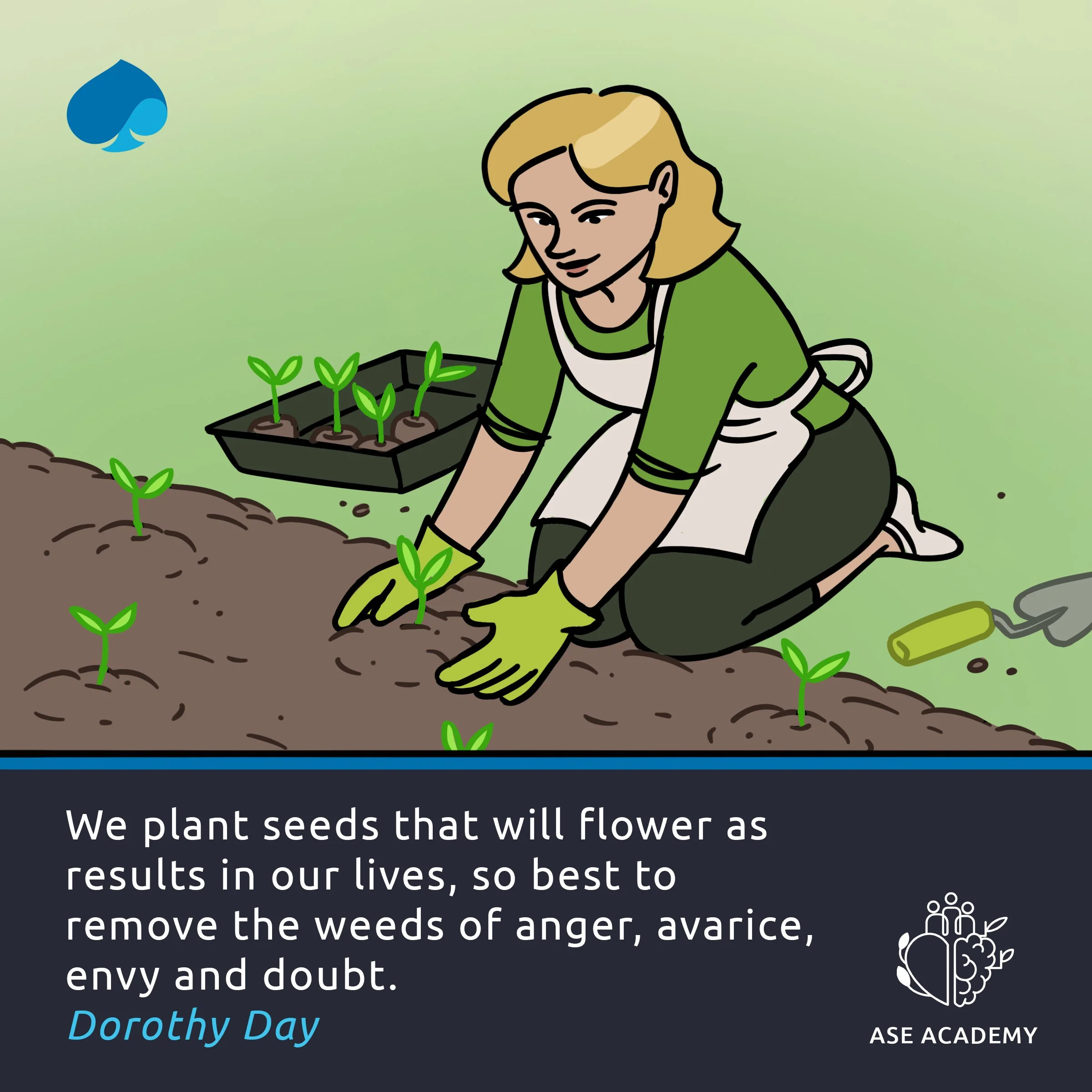
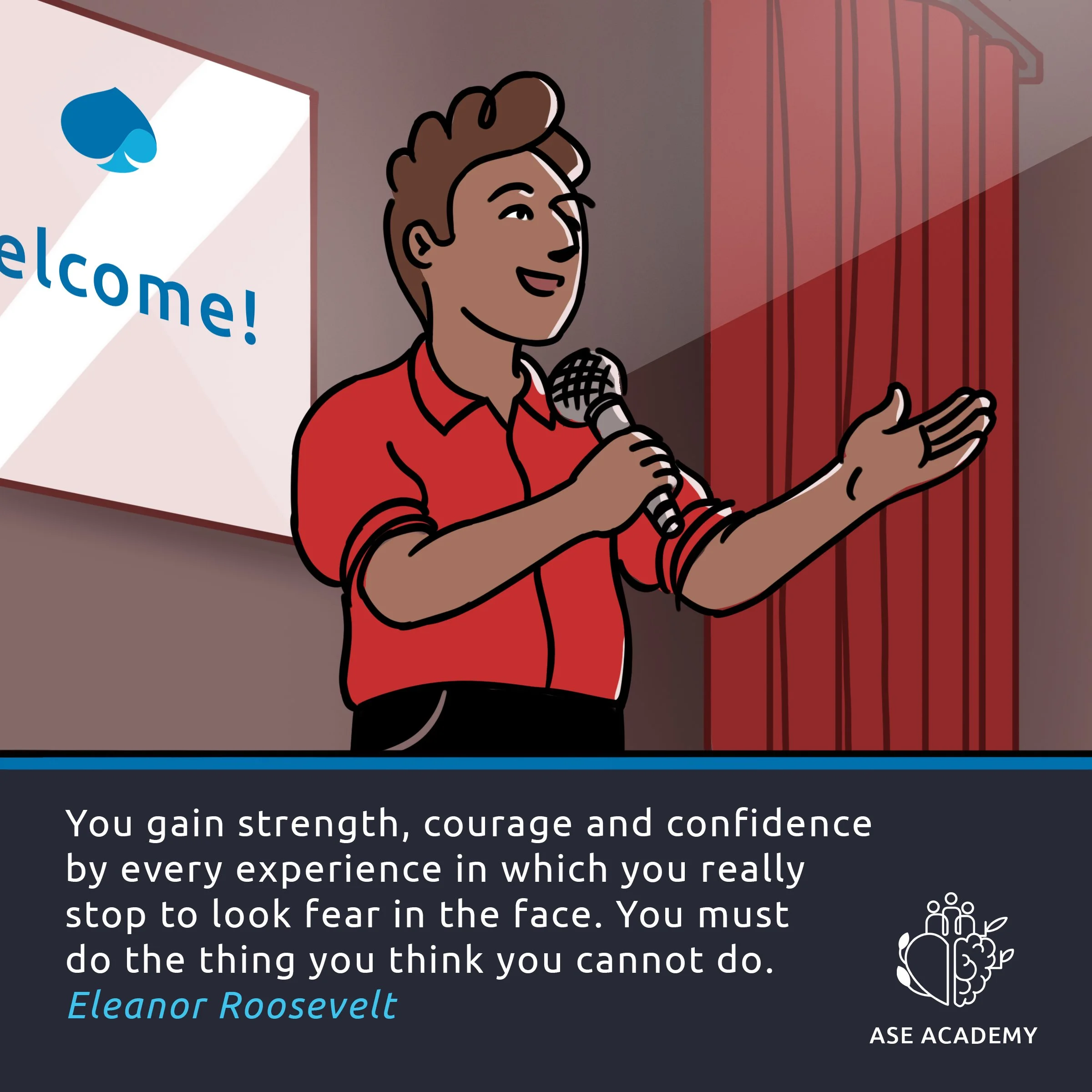
Social Media Posts
Project 2: Golden Treasure UI Design
Context:
As the Art Director at Dreaming Door Games, I oversaw the art department and development pipeline for the studio’s debut project, Golden Treasure. From concept art to in-game assets to UI to marketing, I was responsible for guiding the creative and practical execution of the art team for the duration of the 2-year development cycle. A unique challenge this project faced was in the design of the UI, which had to fit seamlessly into the universe while conveying a large amount of information to the player.
Research:
Understand the project: Golden Treasure is a narrative-driven, hand-painted RPG. The aim of the game is to create a deeply immersive and thought-provoking experience for the player, balancing magic and realism in a setting based on Bronze Age Northern Europe. The game is text based, meaning the UI will be a prominent feature of the screen. There is also a wide range of additional information to convey to the player, from health and energy to items and skills.
Understand the challenge: How to design a UI system that reflects the magical realism of the universe, is flexible enough to convey a wide range of information without overly relying on text, and visually appealing as a major screen element? We researched interesting UI systems from other indie projects for inspiration, such as Banner Saga, Sunless Sea, and Gorogoa, but ultimately relied on our vision of the player experience we wanted to create to make the final design decisions.
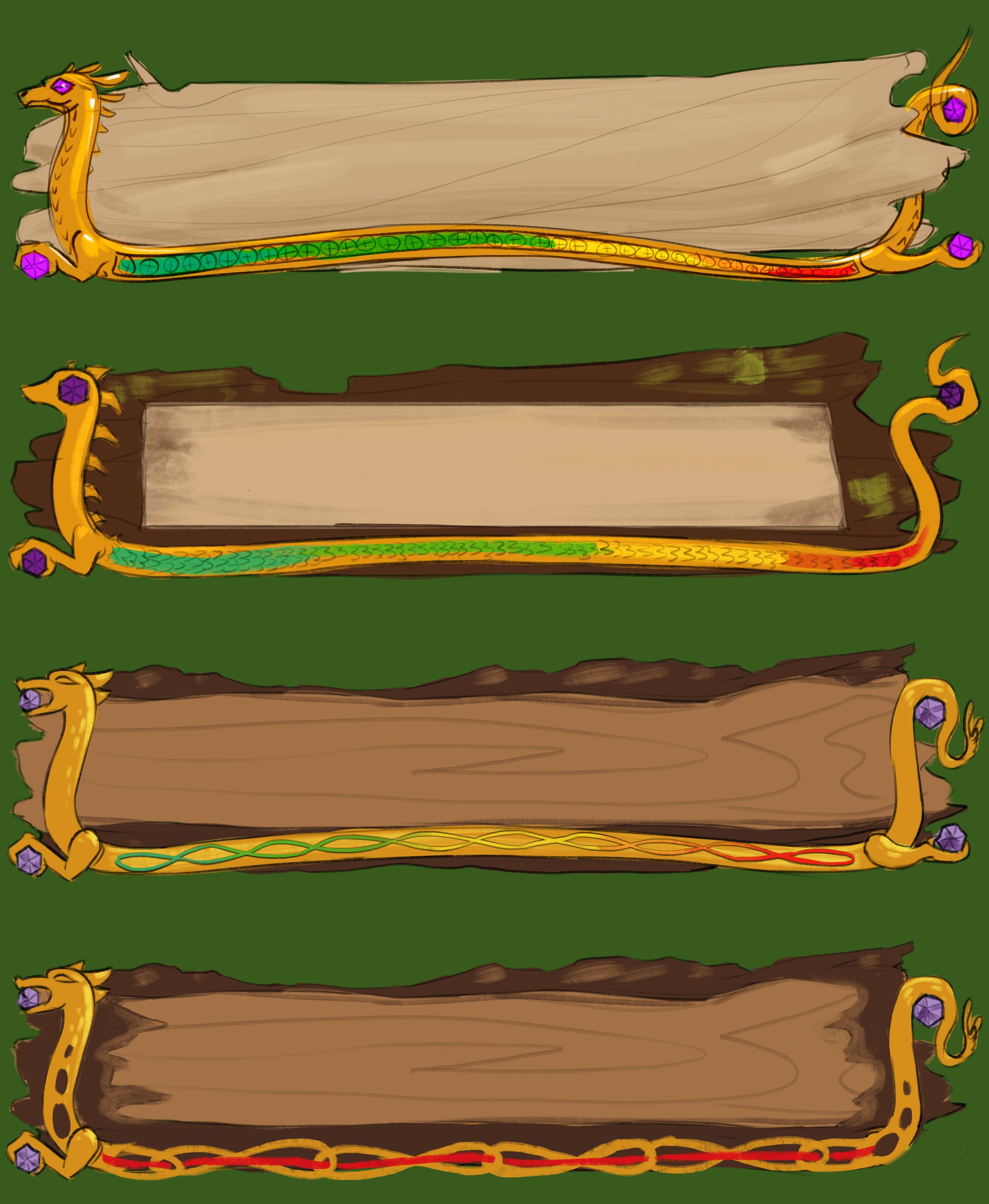
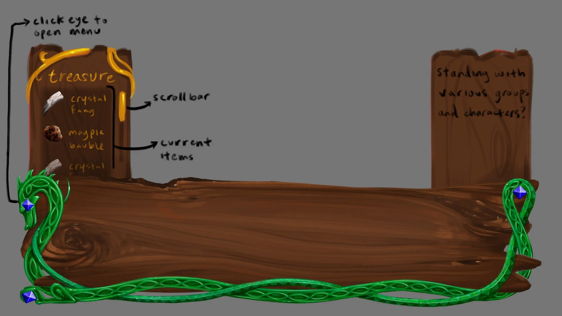
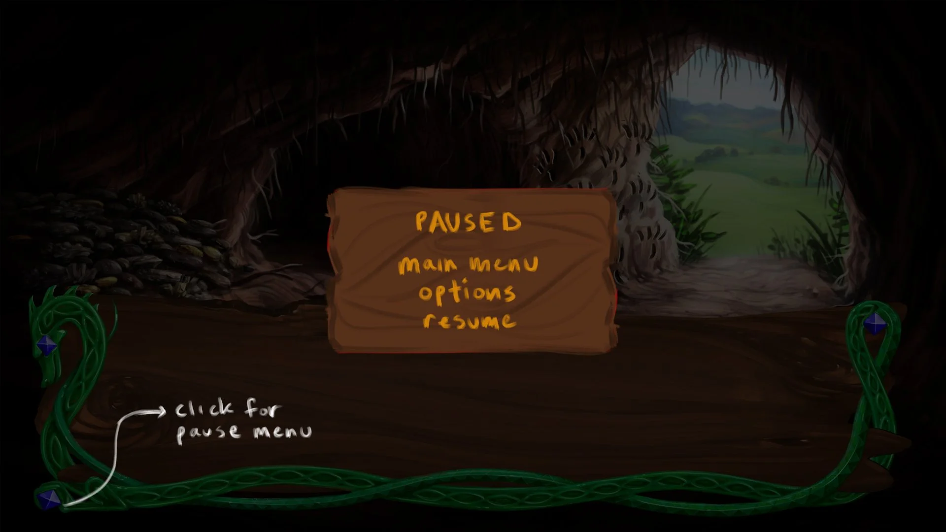
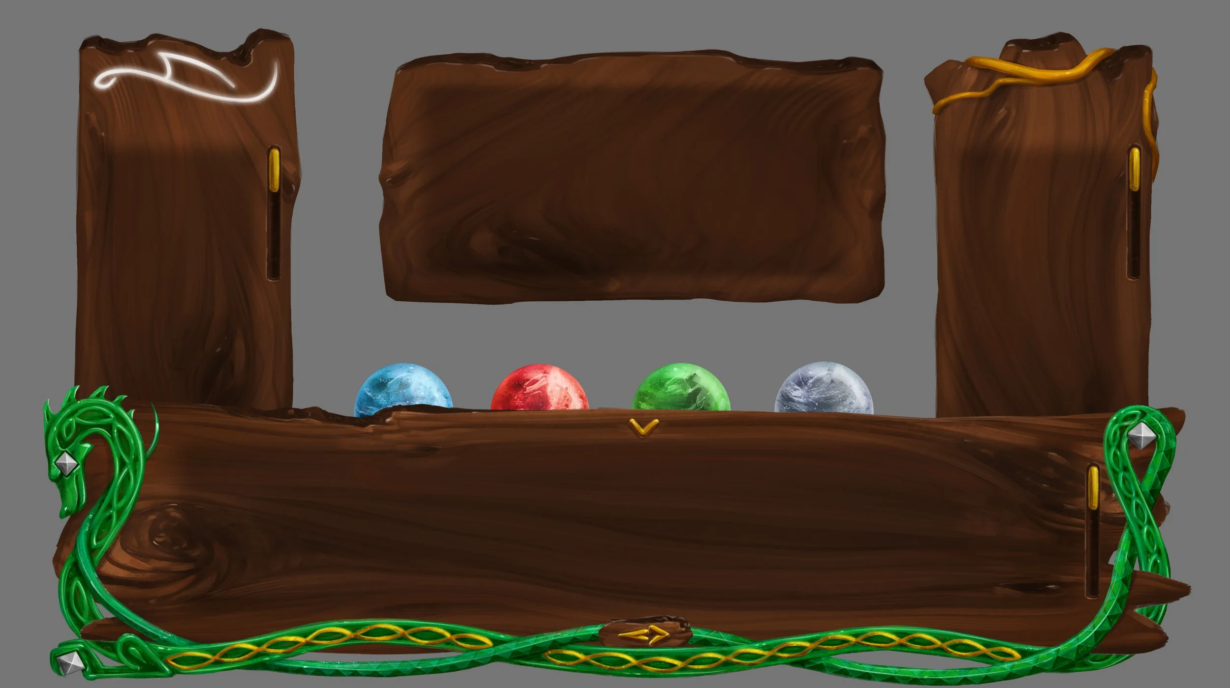
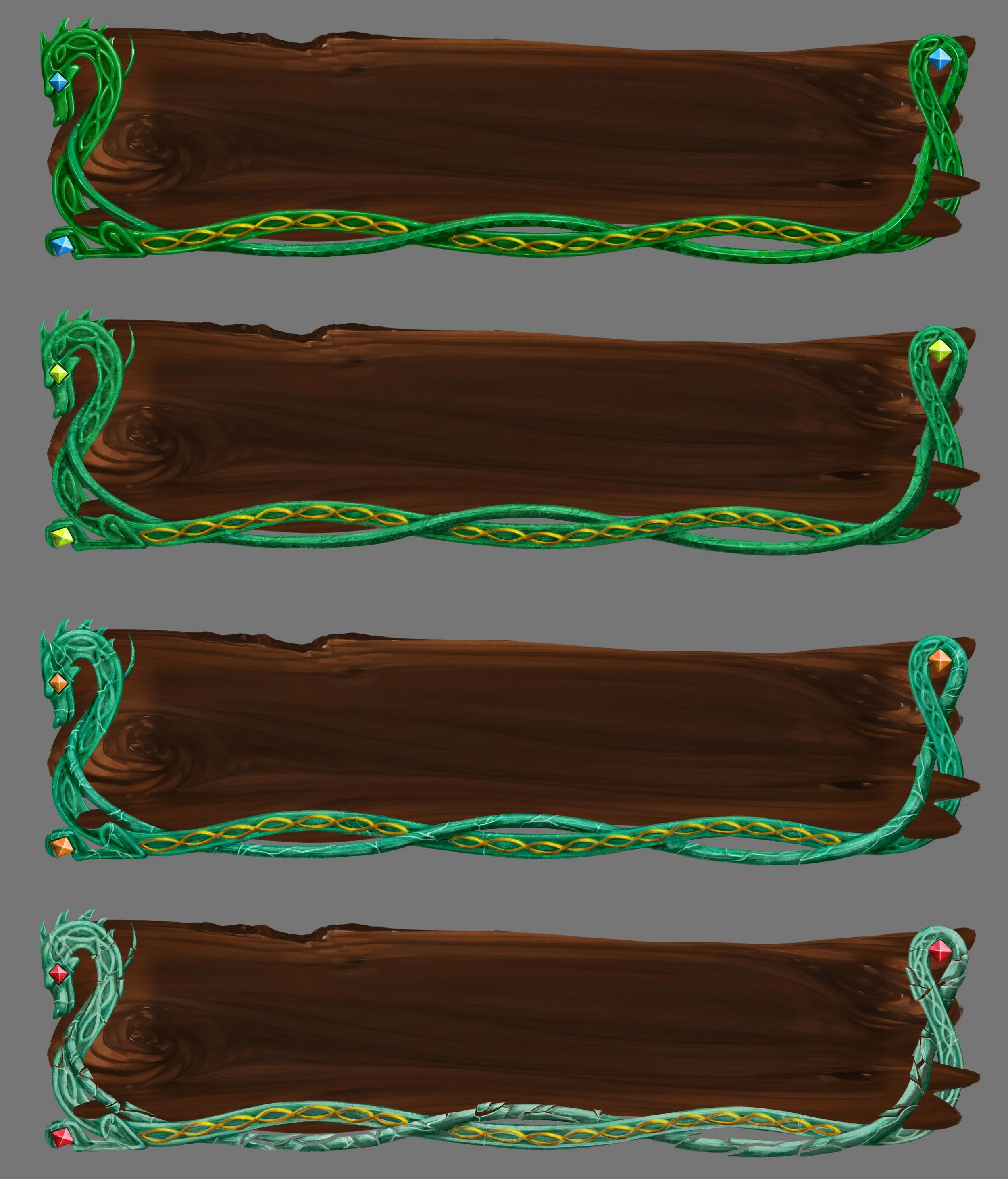
Solution: The final UI is designed around the text box, with key informational elements surrounding it in a clear but unobtrusive way. It features beautiful natural materials to reflect the dragon’s appreciation of beauty and treasure, such as jade, cut gems, and gold. The elements have a naturalistic flow and design, again to reflect the interests of a dragon while still being intuitive to a human player. There are a number of hide-away panels that appear throughout the game on an as-needed basis, but generally the player had ready access to their most important information on the main text-box UI. Additionally, the entire UI can hide away to allow the player to enjoy the game illustrations in their full beauty, helping to center the art as part of the experience.
Process:
Based on the pre-established art style of the game, design the main UI, exploring various options for materials, shapes, and colors
Test the UI for text legibility, element locations, and ease of use for players
Design the health states, energy bar, and element iconography to evoke the dragon perspective
Collaborate with programmers and creative director to align on UI animation, features, and functionality
Golden Treasure Trailer: Includes views of in-game UI
Main UI Concepts + Development
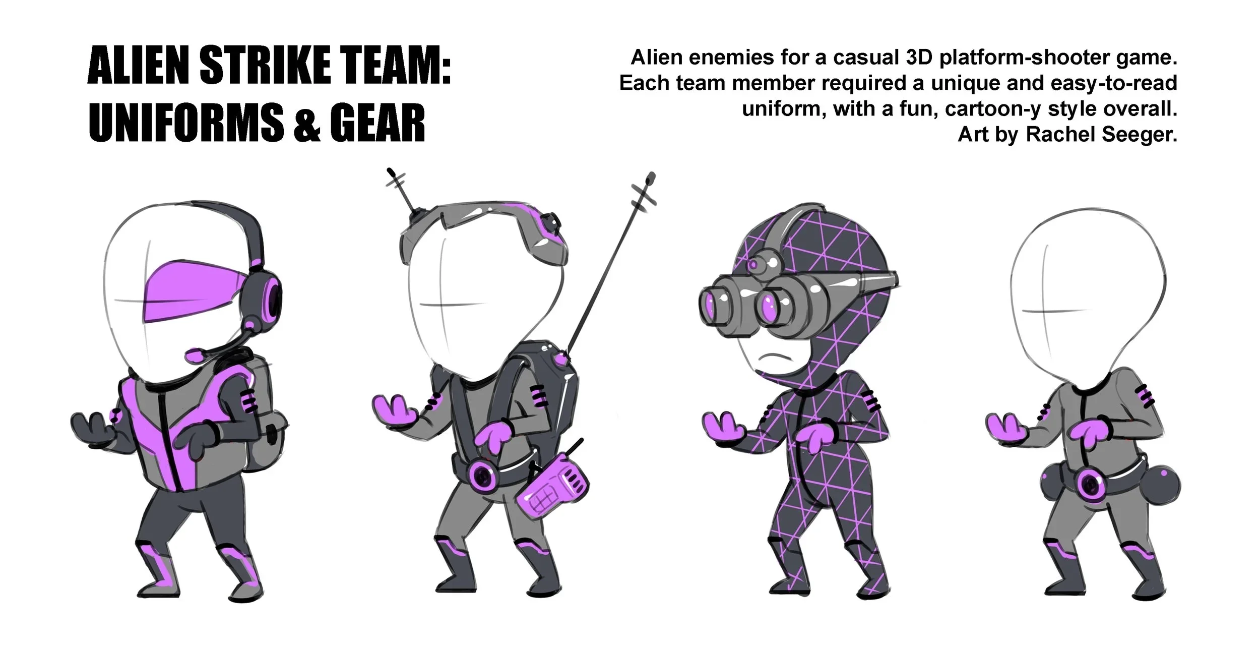
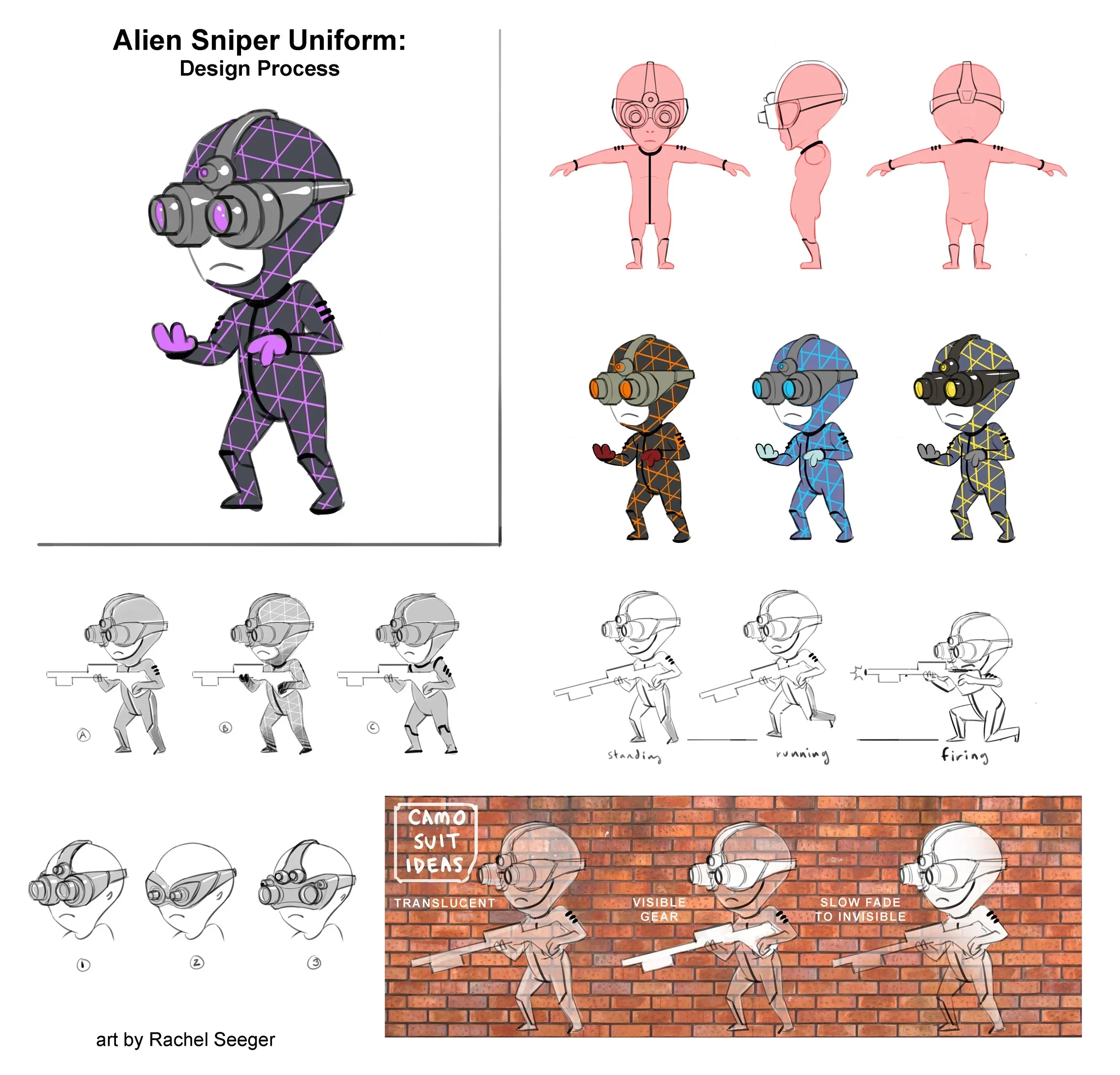
Project 3: Alien Enemy Uniform Design
Context: Skin designs for a sci-fi indie platform-shooter game called Manticore (not yet released). This was a contract role, so I worked within the established art style and tone of the project to design assets that would be passed to the 3D modeling team.
Research: This game took inspiration from real weapons, gear, and team roles, which were then modified for the cartoon-y style and futuristic nature of the game. I researched the roles and typical gear for each member of the strike team, keeping in mind that each character needed to be visually distinct since they would appear very small on screen. I also studied the existing art of the game to better understand the shape language, colors, and mood.
Process:
Thumbnail and iterate each team member’s uniform, ensuring diversity of silhouettes for clarity at a small scale, collaborating with creative director to ensure alignment with project vision
Refine individual character designs with suitable level of detail, patterns, and gear, accounting for their movement patterns and animations
Collaborate with 3D modelers to ensure designs were actionable, making any final tweaks as needed